
I’ve found financial adviser websites usually fit into one of two buckets:
- Look like they’ve been made in 2004 and not touched since then
- Have had an expensive agency make them and are full of advanced features that stops visitors from converting
According to a recent study by Komarketing, 86% of people want to see product and service information on a website homepage. They found that visitors want to see exactly what a business has to offer as soon as they reach the homepage.
And with home pages handling the majority of traffic on a website, it’s probably the most important page to worry about, and to get right!
Here are three things that your homepage of your website needs to do within 5 seconds to make a good impression and make people stay on your website.
Show your brand
The first thing is clearly show your brand.
This may be your colors, your logo. This may be the type of feeling that you want to represent and have your brand exude, right?
But within 5 seconds, people need to have that feeling of what you stand for and be able to remember you point blank.
If they see a social post or another ad pop up online, they need to recognise and go, “Hey, I was on that website last week. I remember the photos. I remember the feeling. I remember the logo.” that kind of thing.
Navigation
The second one is your menu needs to be really obvious and really easy to navigate.
Whether that’s the little hamburger icon, the little lines, which is called a hamburger, it looks like a hamburger.
You click on it, it expands up. Whether that’s the hamburger menu on mobile or if you’re on a desktop, having a clear menu, having four to six items max on there, have a drop down if you need it, but the menu needs to be very clear how to get to it and be easy to use to take people to the page that they ultimately want to go to.
People might land on your homepage, but they really want to get to mortgages or they really want to get to insurance or mortgage protection insurance, income protection insurance.
People always want to go somewhere more specific to them and what they’re after in their visit. So, make it easy for them to get to that place.
Call to action
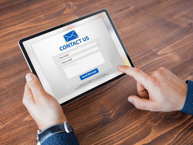
And the last thing a homepage must do in the first 5 seconds some visits is it needs to have at least one conversion button.
That is, a button for people to become a lead.
That might be a book a call or a contact us in that top right kind of position on the site. It should ideally have a second CTA as well, but make sure it’s really easy for people to convert to become a lead for you by having a nice big button, usually top right, sometimes on the left if you’re using it on the hero section.


